


CHORD Brand Identity
The CHORD brand identity brings the instrument to life through its logo, typography, colour palette, and visual language. Each element is designed to reflect CHORD’s blend of music, movement, technology, and human connection.


01
Black Logo

Set in Helvetica Neue Bold, the black logo pairs a refined wordmark with a hovering hand above the “O,” evoking the instrument’s ergonomic grip and its touchless, gesture-responsive play.


02
White Logo
Set in Helvetica Neue Bold, the white logo pairs a refined wordmark with a hovering hand above the “O,” evoking the instrument’s ergonomic grip and its touchless, gesture-responsive play.
Font 1
Helvetica
The Helvetica font family provides a clean, modern, and highly legible foundation for CHORD's primary logo.

Font 2
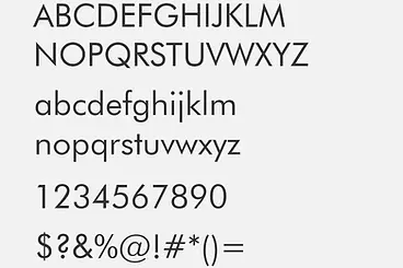
Futura
Futura is the primary main text font for CHORD’s brochures, website, outreach materials, and communications. Its timeless simplicity keeps the brand clear, accessible, and consistent across platforms.
Font 3
EB Garamond
EB Garamond adds a warm, editorial character to CHORD’s visual language. Reserved for special communications, featured quotations, and moments of emphasis, it brings a sense of artistry and tradition that complements the clarity of the primary typeface.


Custom CHORD Illustrations
Performers
Handmade digital drawings accompany CHORD manuals, messaging, brochures, and other communications. Their crafted, hand-drawn quality reflects CHORD’s focus on human-centred making, while their minimalist forms provide an intuitive way to depict different types of interactions. Commonly referred to as line drawings, many feature colour-accented elements that highlight a particular action, object, or point of interaction.

Custom CHORD Illustrations

Instrument
CHORD Instrument
Images


